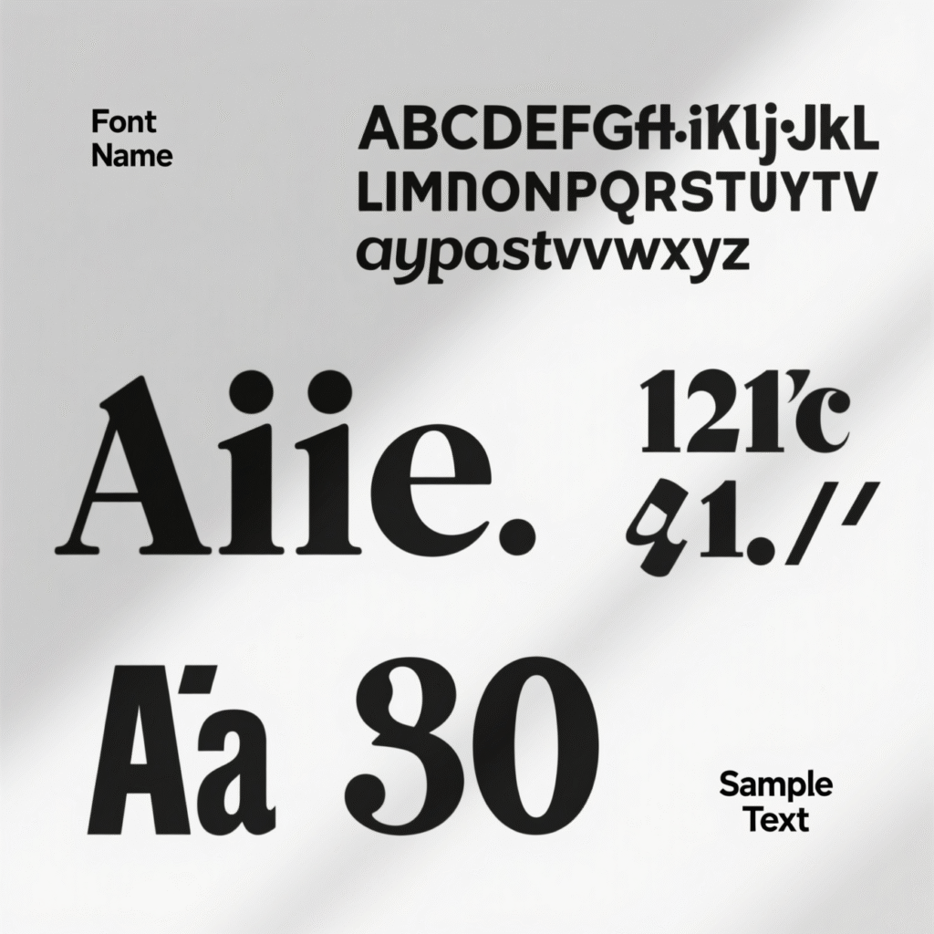
Free Fonts That Give Your Portfolio a Professional Look

Free Fonts That Give Your Portfolio a Professional Look
Your personal portfolio is more than just a website—it’s your first impression. A professional look can turn casual visitors into serious clients. One of the easiest ways to achieve this is by using the right fonts. Fonts may seem small, but they play a big role in how people feel about your work. Clean, easy-to-read fonts make your portfolio stand out and show that you care about details.
Why Fonts Matter for a Professional Look
Imagine you are meeting a client for the first time. Would you wear a wrinkled T-shirt or a neat outfit? Fonts work the same way. If your text is messy or hard to read, visitors may leave quickly. But when your typography looks polished, your portfolio feels trustworthy.
1. Google Fonts – Open Sans
Open Sans is a free font that is clear, modern, and works well on any device. For example, Rahul, a graphic designer, switched to Open Sans on his portfolio. Within a month, visitors stayed longer on his website because they found it easy to read.
2. Google Fonts – Lato
Lato adds a warm, friendly feel while still maintaining a professional look. This is great for freelancers who want to show both creativity and reliability. Lato pairs well with bold headings and simple body text.
3. Google Fonts – Montserrat
If you want your headings to pop, Montserrat is perfect. A web developer named Priya redesigned her portfolio using Montserrat for titles and Roboto for paragraphs. The clean combination helped her land three new projects in two weeks.
4. Google Fonts – Poppins
Poppins gives your portfolio a sleek, modern style. It works beautifully for designers or marketers who want a bold yet simple font. Using Poppins shows confidence, which adds to your professional appeal.
5. Google Fonts – Roboto
Roboto is a favorite for many professionals because it’s flexible. Whether you’re building a personal portfolio or an online resume, Roboto makes your text look balanced and well-structured.
Tips to Use Fonts Correctly
Use two fonts at most—one for headings and one for body text.
Make sure the font size is easy to read, especially on mobile.
Stick to neutral colors for text to keep that professional look.
Test your portfolio on different devices to ensure fonts display well everywhere.
Final Thoughts
A professional look is not about expensive tools or flashy designs. Sometimes, it’s as simple as choosing the right free fonts. By picking clean and consistent typography, you can create a portfolio that builds trust and impresses clients. Remember, your portfolio speaks before you do—so let it speak well!
Lorem ipsum dolor sit amet, consectetur adipiscing elit. Ut elit tellus, luctus nec ullamcorper mattis, pulvinar dapibus leo.
Free Fonts That Give Your Portfolio a Professional Look
Your personal portfolio is more than just a website—it’s your first impression. A professional look can turn casual visitors into serious clients. One of the easiest ways to achieve this is by using the right fonts. Fonts may seem small, but they play a big role in how people feel about your work. Clean, easy-to-read fonts make your portfolio stand out and show that you care about details.
Why Fonts Matter for a Professional Look
Imagine you are meeting a client for the first time. Would you wear a wrinkled T-shirt or a neat outfit? Fonts work the same way. If your text is messy or hard to read, visitors may leave quickly. But when your typography looks polished, your portfolio feels trustworthy.
1. Google Fonts – Open Sans
Open Sans is a free font that is clear, modern, and works well on any device. For example, Rahul, a graphic designer, switched to Open Sans on his portfolio. Within a month, visitors stayed longer on his website because they found it easy to read.
2. Google Fonts – Lato
Lato adds a warm, friendly feel while still maintaining a professional look. This is great for freelancers who want to show both creativity and reliability. Lato pairs well with bold headings and simple body text.
3. Google Fonts – Montserrat
If you want your headings to pop, Montserrat is perfect. A web developer named Priya redesigned her portfolio using Montserrat for titles and Roboto for paragraphs. The clean combination helped her land three new projects in two weeks.
4. Google Fonts – Poppins
Poppins gives your portfolio a sleek, modern style. It works beautifully for designers or marketers who want a bold yet simple font. Using Poppins shows confidence, which adds to your professional appeal.
5. Google Fonts – Roboto
Roboto is a favorite for many professionals because it’s flexible. Whether you’re building a personal portfolio or an online resume, Roboto makes your text look balanced and well-structured.
Tips to Use Fonts Correctly
Use two fonts at most—one for headings and one for body text.
Make sure the font size is easy to read, especially on mobile.
Stick to neutral colors for text to keep that professional look.
Test your portfolio on different devices to ensure fonts display well everywhere.
Final Thoughts
A professional look is not about expensive tools or flashy designs. Sometimes, it’s as simple as choosing the right free fonts. By picking clean and consistent typography, you can create a portfolio that builds trust and impresses clients. Remember, your portfolio speaks before you do—so let it speak well!